
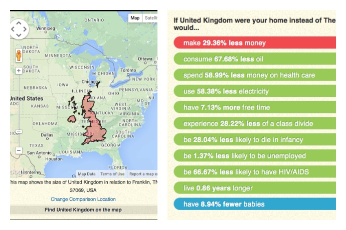
Lately I’ve gotten sucked into a new website called If It Were My Home, which compares countries around the world to your own hometown, or any other location you designate in their search engine. You’ll get a quick snapshot of all kinds of comparable stats like country size, average income, life expectancy, health care spent, and free time.
Let’s just say Americans work way, way too much.
I’m trying to raise my kids to understand and appreciate that lots of people live differently than we do, but it’s hard when kids — at least those as young as mine are — can’t really imagine life outside their own experience. That’s where I think this is really helpful.
Having the map lay these countries out right on top of your own hometown for geographical comparison is such a great visual aid — for me, as well as them. Plus you get some quick Wikipedia-like background along with reading recommendations to learn more, should your kids become fascinated by Fiji or Hong Kong or Afghanistan.

The statistics about life expectancy, income, birth rate, and energy are pretty high-concept, and is a great discussion starter with grade-schoolers fascinated by sociology and geography; it’s also a smart resource for middle- or high-school aged kids writing school reports. But of course know this is based on averages; if you’re a high-earner, the UK will look more appealing than it does to most of us.
Then again, learning about the 44.3% unemployment rate in Bosnia right now might make a child feel more than just grateful; maybe it will create a new commitment to getting involved with helping kids in other countries.
And it’s kind of making me think I might start packing our bags for a move to Denmark, where I would be make less money, but be spending way less on health care, consume fewer natural resources, and enjoy an average of 26.72% more free time. Sounds nice!
You can compare your home to countries around the world at IfItWereMyHome.com.