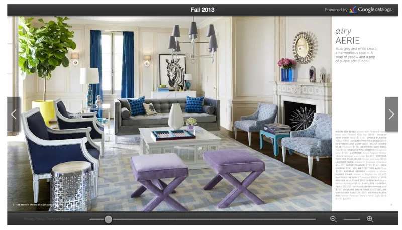
I always love seeing the way companies are using technology to bring their online catalogs to life and one of my favorite design brands is jumping into the fray with some serous awesomeness for fall. Both technologically and otherwise.
The Jonathan Adler Fall Catalog can be read like an online magazine, flipping through the spreads as if they were paper. Only now you mouse over an image, and you’ll see little price tag icons.
Click them and you get quick info and pricing for a particular item plus other easy recommendations. If you’re really interested in something, you can click right through to the site for loads of detail.
It’s not as big on the wow factor as the IKEA interactive catalog that includes virtual reality placement of the items in your home via a companion app, but it’s a nice small step towards easier online shopping.
It’s pretty clear that this is future of retailing–and a lot of it is already here. According to some numbers we’ve seen, there are 75 million active online shoppers, or 1/3 of the total internet population. With women controlling 85% of all purchase decisions, it makes sense for every big retailer to start making online shopping experiences easier, more fun (yes!) and definitely less hunt-and-peck transactional.
We’re glad to see brands making it easier to bring that eye candy right into our homes with a click or two. Kind of nice for the trees, too –Liz
Visit the interactive Jonathan Adler Fall Online Catalog and see what catches your eye.


Leave a Reply