Leave it to my twelve-year-old-daughter to be way ahead of me on the Instagram design tricks — in this case, how to make an ombre text overlay in Instagram stories. I fell instantly in love.
Now we’re not the types (ha) to spend hours making our fonts look perfect — as you can tell from our Instagram stories feed — but I think this is such a gorgeous effect, that once you’ve figured it out, it’s simple enough to give a try. Here’s how:
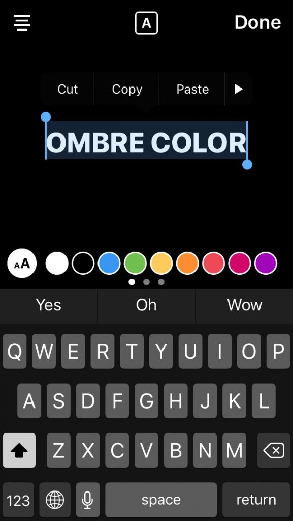
1. Type in your text. I think all caps happens to look nicer with an ombre effect because the heights of the letters are uniform, but you do you.

2. Tap and hold the type to “select all. You’ll see the edit points on both the left and the right, and the pre-selected row of colors will pop up at the bottom above your keyboard.
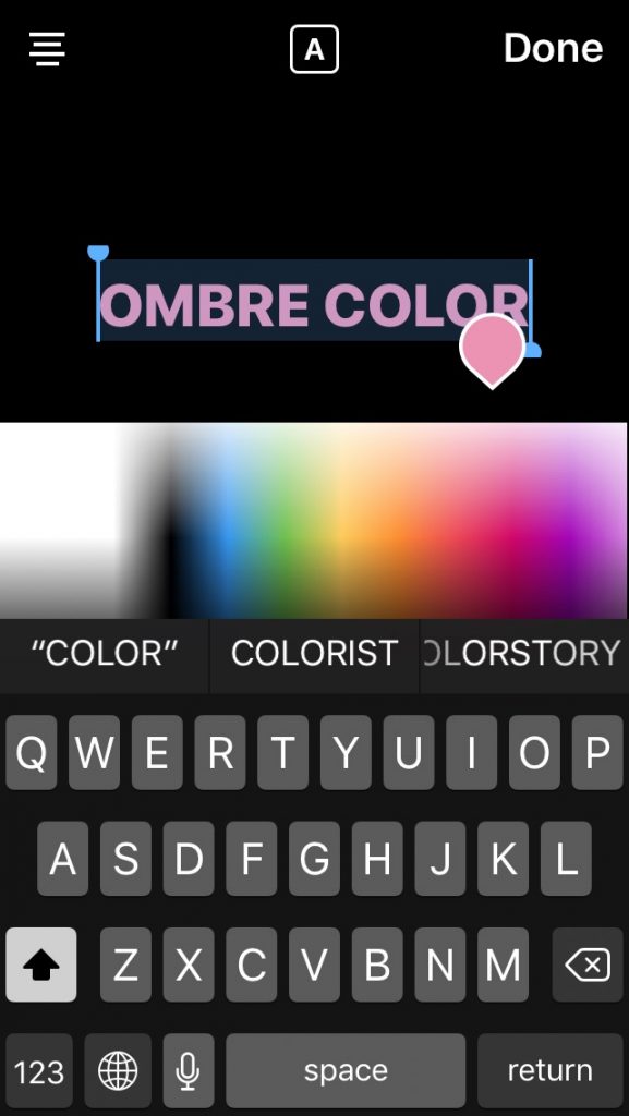
3. Press and hold any color to bring up the entire color palette. (A cool tip in itself if you didn’t know this already!)
Bonus color tip: You can swipe left along that row of colored dots to bring up a secondary palette from red to skin tones to forest green; then swipe again to bring up blacks and grey tones.

4. Tap the color you’d like to work with, and keeping your finger on the screen, drag it to the top, above the palette until you reach the lightest version of that color. In this case, I chose fuschia, so the very top will show a drop of pale pink.
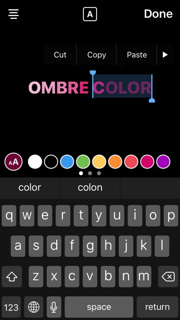
5. This is the tricky part. Keeping your right thumb pressed down on the color palette, take your left thumb and tap the left-most select point around your type. Now you’re going to drag your left thumb from left to right along your type, one letter at a time.

For each letter you eliminate (because you’re dragging to the right), you’re going to drop your right thumb down slightly along the color palette to highlight a new, darker shade.
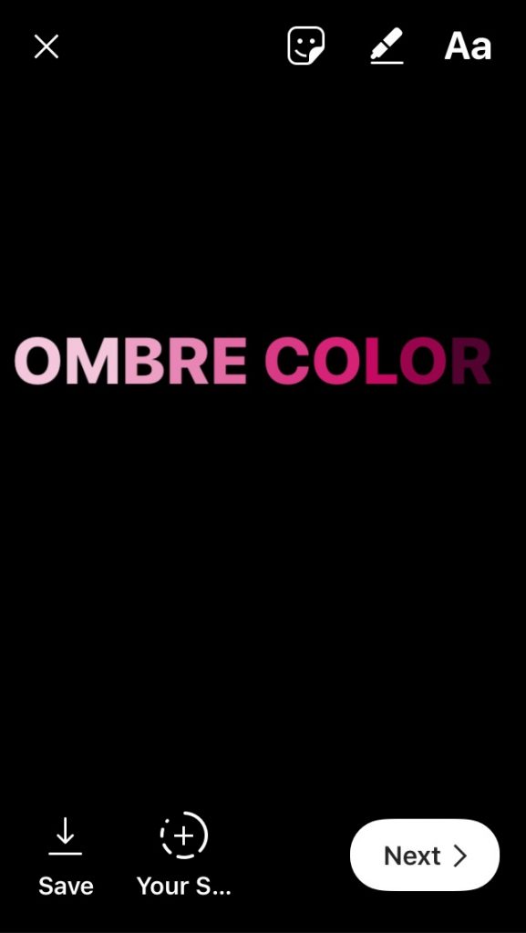
6. Repeat this action (drag right/drop down, drag right/drop down) until you’ve gone across the entire text and reached the darkest shade that you want in your palette. And…you’re done! Save your work, or share to your story.

Looks great, right? And obviously you can go top to bottom if you’d prefer the color to have a “fade off” ombre effect instead of a “fade on” effect.
Happy ‘gramming!


Leave a Reply