
Thanks to Twitter user Red Long, who describes himself as blind in his bio, I found a terrific tip to use a feature in your Twitter accessibility features to help your visually impaired readers. However in digging deeper, turns out there are a whole bunch of really smart accessibility features built into your settings that can make the experience better for both you and a greater number of followers.
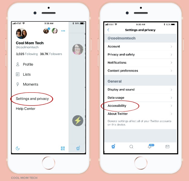
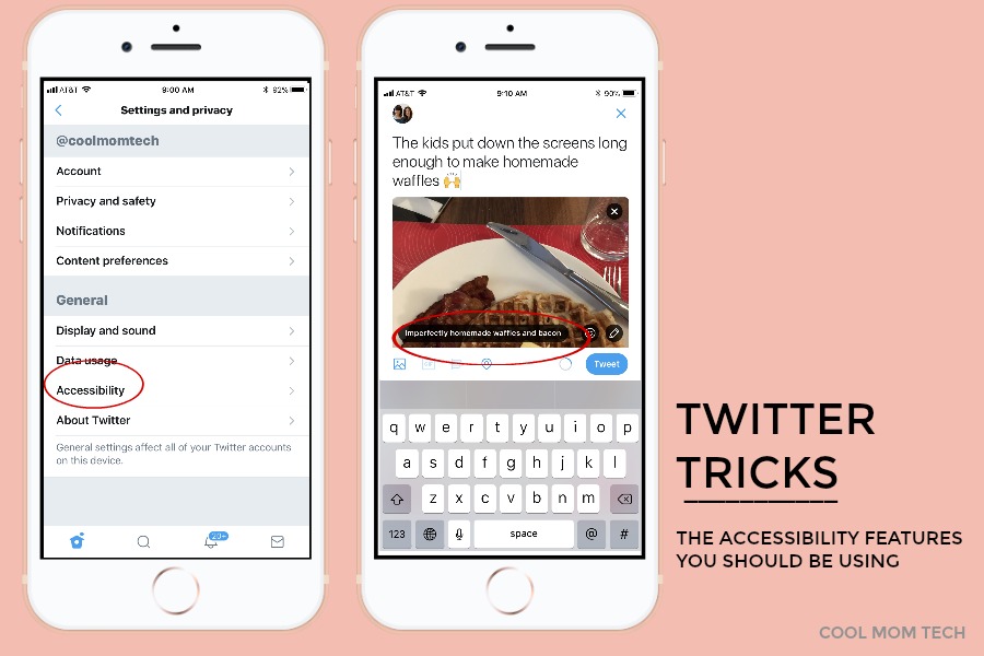
Go to your profile and click Settings and privacy. From there, scroll down and click on Accessibility to reveal your options.
First, you’ll see VoiceOver, which is Twitter’s text-to-speech feature should you want tweets read to you. I don’t recommend checking social media or texting in the car, but you could have another passenger activate it should you want to hear tweets read to you out loud, audiobook style.
In VoiceOver, you can select to pronounce # as “hashtag” which is ideal if you don’t want to hear it read as “number.” (Get with the times, iOS!)
You can include usernames in timelines which is a bigger deal now that Twitter has lengthened user names and people are having more fun with them. Turn this on, and you can hear both the display name and user name. Now this isn’t a big deal with @coolmomtech, because our display (profile) name also happens to be…Cool Mom Tech. But it may help you remember that @stephenathome is Stephen Colbert, for example.
Magic Tap action is another cool accessibility feature, offering some great touch shortcuts. It allows you to tap with two fingers to compose a tweet, or alternatively to show a menu of tweet actions you can shortcut, like reply, retweet, or favorite.

Another feature that’s great for any of us, is Increase color contrast. It makes the type a darker, stronger color than the pale charcoal designed into Twitter. You can see the difference above if you look closely at the copy under the subheads, the color of the nav icons, and the toggle button color.
But the final feature I’m happy to learn about came from Red Long‘s tweet about using compose image descriptions, something I had no idea existed. And I’m on Twitter a lot!

The same reason we use alt text in our photos on our website (something other publishers know all about!) which helps visually impaired readers to understand what an uploaded image or video is about, you can do the same for your Twitter feed.
When you attach a photo (no video function just yet), simply tap add description to insert up to 420 characters of descriptive text like the example I made above, then click apply.
It’s an especially smart idea should you be posting a screenshot of another tweet without linking to it — something a lot of people do these days when they want to comment on tweets from government figures they (ahem) don’t particularly like, or think may be removed.
Adding a description allows you to summarize the content of the tweet screenshot or image you’re sharing so more people can understand your clever commentary.
As Rob described it, it lets you increase your ability to reach visually impaired readers, and help them interact with your pictures. He adds “it’s really simple and makes a huge difference to our twitter experience allowing us to see your images our way.”
Thanks, Rob!